Improving Home Screen Navigation
As the UX designer in the Growth team, I introduced visual hierarchy on the main key metrics of our app home screen, which led to significant improvements in user engagement.
Context
More than 70% of our app users don’t come back after the first session. When it comes to an app experience, first impressions matter, and the home screens play a key role in shaping that impression. We lacked a comprehensive understanding of the user needs during this crucial setup phase and their perception of the core value of the product.
My role
As the dedicated UX designer to the Growth team, I identified some quick win opportunities to improve the main metrics of the app (search execution and saved searches). The result led to an almost 20% impact on one of the main metrics, as well as solidified our case to spend more effort and time in improving the app experience for new users.
Keep scrolling to learn more about how I did this.
Design process
Researching existing UI components
With limited research and content design support, I focused on the following deliverables:
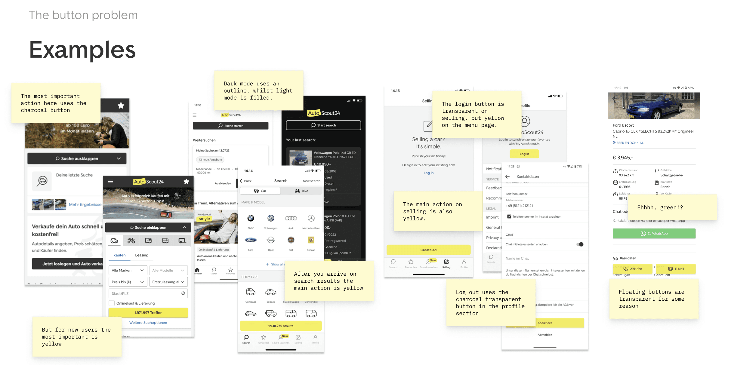
Documenting existing UI solutions
- Analysed our current UI components used across different screens
- Focused on their purpose, behavior, and visual design
- Spotted inconsistencies and usability issues
Heuristic design principles exploration
- Leveraged heuristic design principles
- Applied principles such as visibility, consistency, and user control
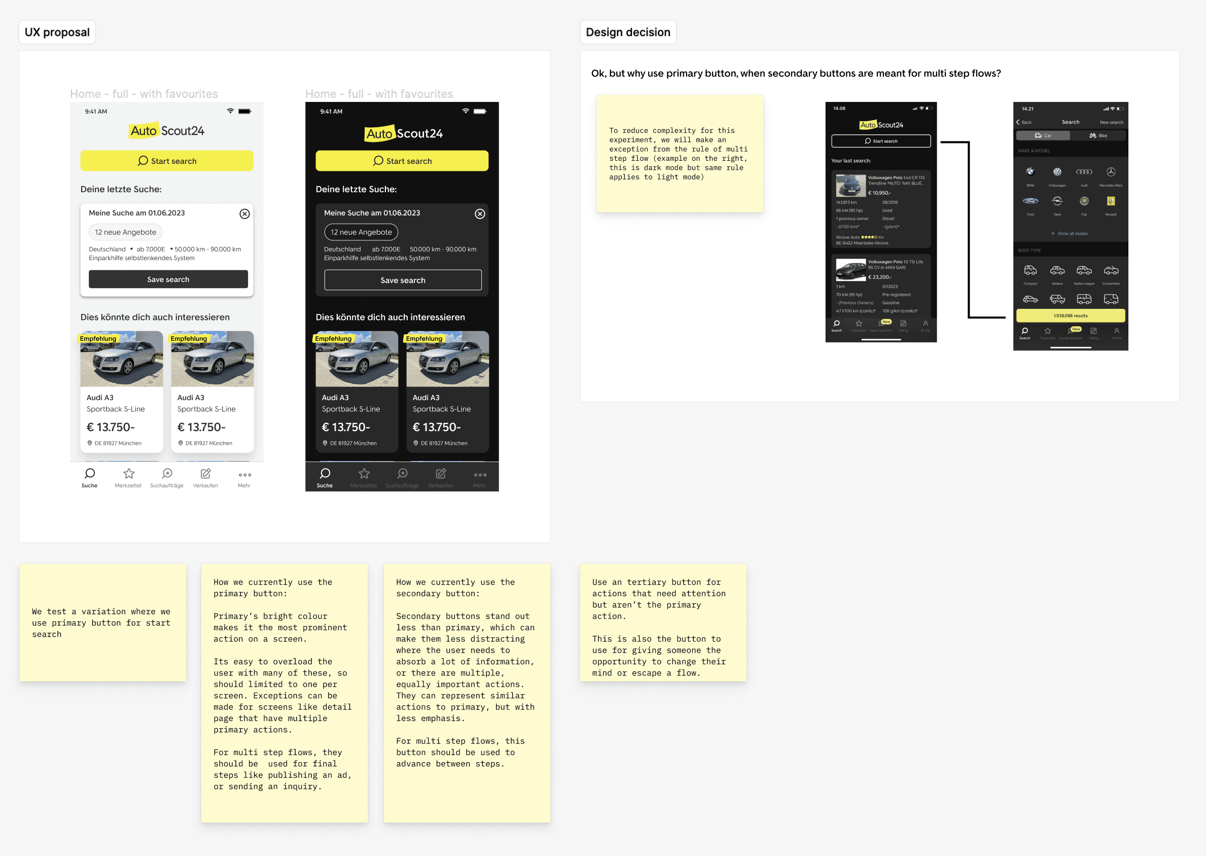
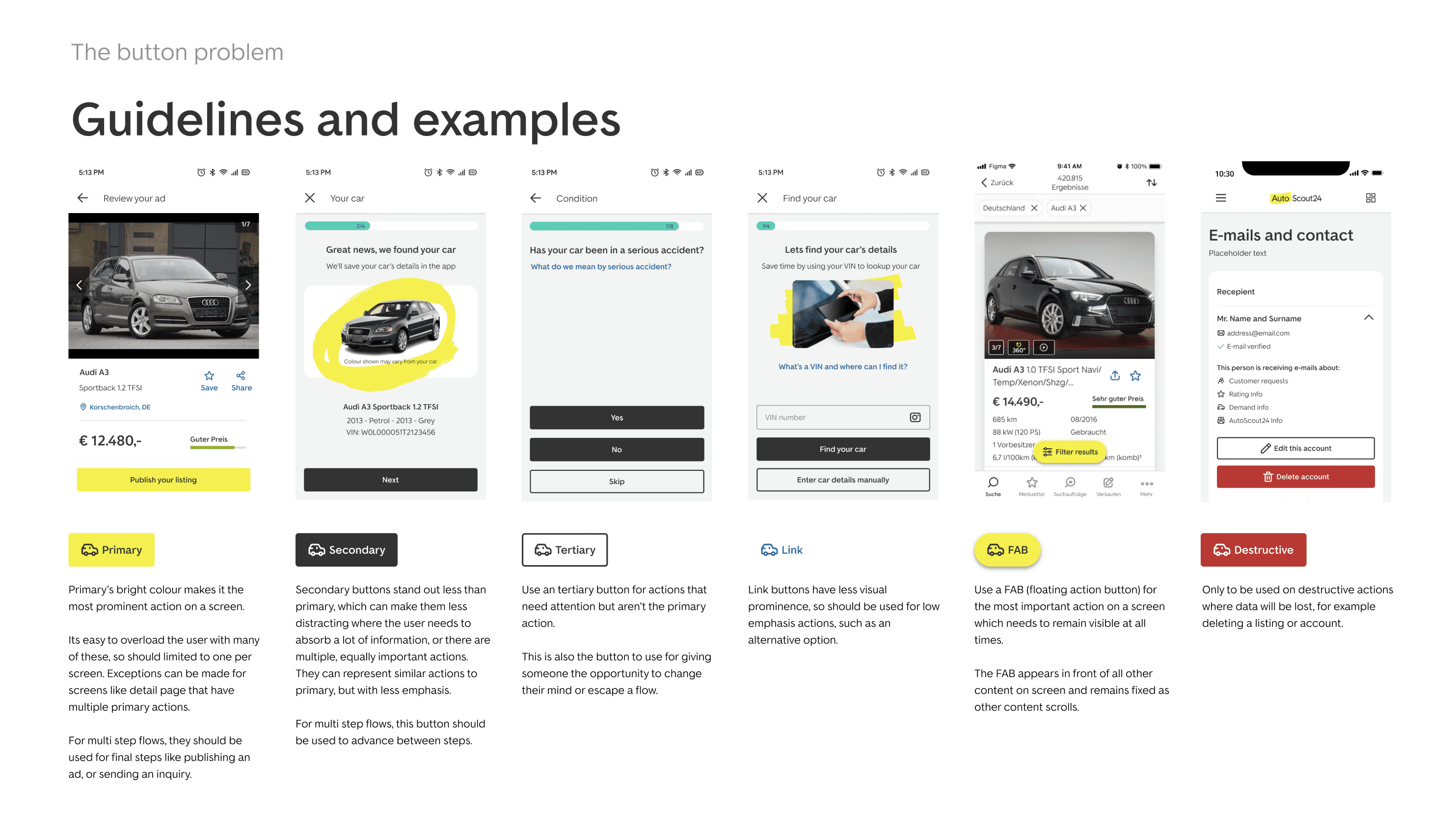
CTA Visual Hierarchy Enhancement Proposal
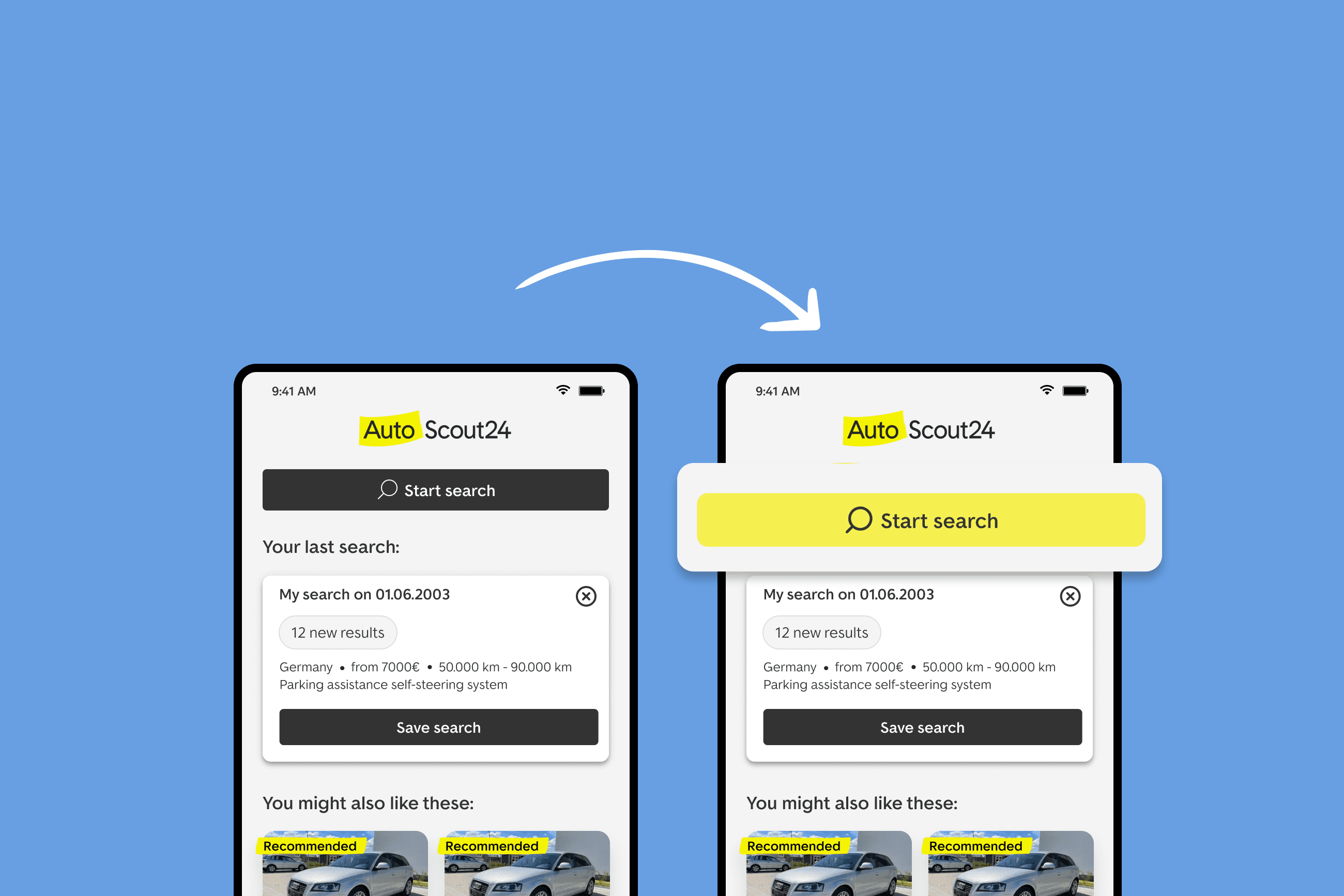
- Focused on the main call-to-action button (CTA) “Start search”
- Defined the visual hierarchy (color and placement)
- Included both light and dark mode designs
- Gathered feedback from the UX and engineering teams during design crit sessions
Hypothesis
After gathering data and insights to understand what exactly are the main opportunities that should be solved, we decided to prioritize the main CTA. We saw it as a quick learning to see if visual hierarchy can positively impact the user experience on the app home screen. We decided we would do this when we would see an increase in search executions and saved searches by at least 5%.
Why did we prioritise the CTA button?
After looking at the data, we learned that the “Start search” button has the highest engagement rate on the AutoScout24 app.
We knew that data alone doesn’t tell the whole story, and we needed further user validation to explore the motivations, pains, and expectations behind the main action button. This first experiment though, would prepare a stronger case for investing more research and design effort into improving the overall user experience.
Design proposal and testing
Based on the UI exploration, I decided to elevate the “Start search” CTA to primary status on the home screen. This would provide users with immediate visibility of the system status and help users immediately understand the purpose of the home screen.
I also took into consideration the next steps in the flow, and returning sessions as a use case, to make sure it doesn’t clash with other action buttons.
In parallel with this proposal, I also created a proposal for button hierarchy on the app, to maintain consistency between button rules on the app.
Final results
After running the experiment for two weeks, these results validated our hypothesis and helped us build a case for the next steps to improve the AutoScout app experience
- Primary KPI (search execution): inconclusive
- Saved searches: +19.25%
- Sessions from Saved Search Push notifications: 1.84%
Learnings
We observed inconclusive results on the primary metric search execution, but a crucial finding emerged: a well-defined CTA hierarchy on the home screen significantly benefits users.
This experiment proved that design hierarchy is key for our product KPIs, and how thoughtful design adjustments can impact user behavior, get us learnings, and contribute to overall app success.