Redesigning O My Bag’s Product Page
Improved O My Bag’s product page by addressing user concerns and prioritizing key features.
The problem
From December 2020 to April 2021, O My Bag’s online sales have seen a significant increase. However, the online store faced two times higher return rates than its physical stores.
O My Bag wanted to discover opportunities to improve the product page and help users better understand the product details.
Through my user research and Hotjar heatmaps, I found insights about customers engaged with product pages and understood what users want and care about in their online shopping experience.
My role
As the internal UX Designer, I developed high-fidelity wireframes, clickable prototypes, and user flows to enhance user engagement and increase the online store’s conversion rate.
In collaboration with the e-commerce manager, we also strategized an offline store integration to bridge online shopping with in-person store pick-ups during the lockdown period.
Discover
Research goals
I started by creating a research plan (available upon request) that helped me structure my work and focus on my target audience:
- People who shop online for fashion items regularly
- People with mid to high awareness of fashion sustainability
Through this audience, I set the goal to understand what features influence users in their buying decision, as well as identify opportunities for O My Bag’s product pages.
Methodologies
- O My Bag’s online store analysis to understand how current users navigate product pages
- Competitive analysis to evaluate other successful fashion companies
- User surveys to provide insight into the kind of information visitors are seeking when exploring online fashion companies
Understand
Product page analysis
Before diving into a product page redesign, I used Hotjar to look at page session recordings and mapped out the product page sections by looking at key user patterns. Some examples are:
- Product images: how users navigated through the product visuals
- About section: what do users look at, where do they tap most often
- Review section: how do users interact with this section
- Shipping and returns: how often do users click on this section?
- Rage clicks and u-turns: where do these actions happen? How often do they happen in the same spot?
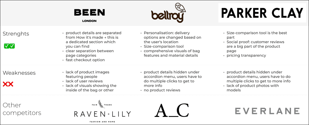
Benchmark analysis
For the competitor analysis, I wanted to identify some key features and patterns on their product pages. When establishing strengths and weaknesses, I looked at overall design and interaction, clarity and credibility.
I specifically looked at e-commerce competitors with both a physical and an online store and had a fair fashion focus on their products.
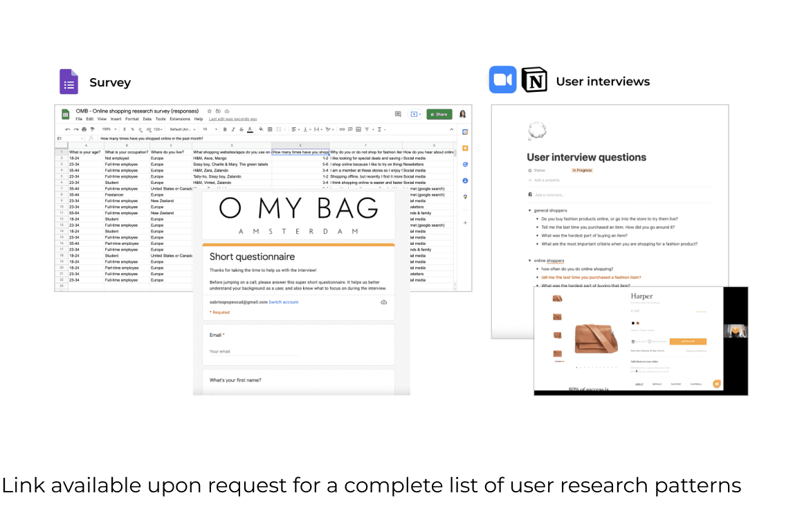
User research
To better understand the user pain points when shopping online for bags, I conducted 7 user interviews, collected 22 surveys, and usability testing on the current website.
We gathered all the information and synthesized several root problems and potential solutions through affinity mapping and user journeys.
Summarized findings
- Lack of information: it’s hard to find information about the product stock in physical stores
- Inconsistent visual content: some product pages miss images with the inside of the bag; not all pages have videos
- Lack of structure: information about shipping and returns is scattered across different pages
- Trust in the brand: users know the company and its products, so they don’t prioritize user reviews
- Visualized product details: users prefer a visual representation of the features versus reading about them
Define
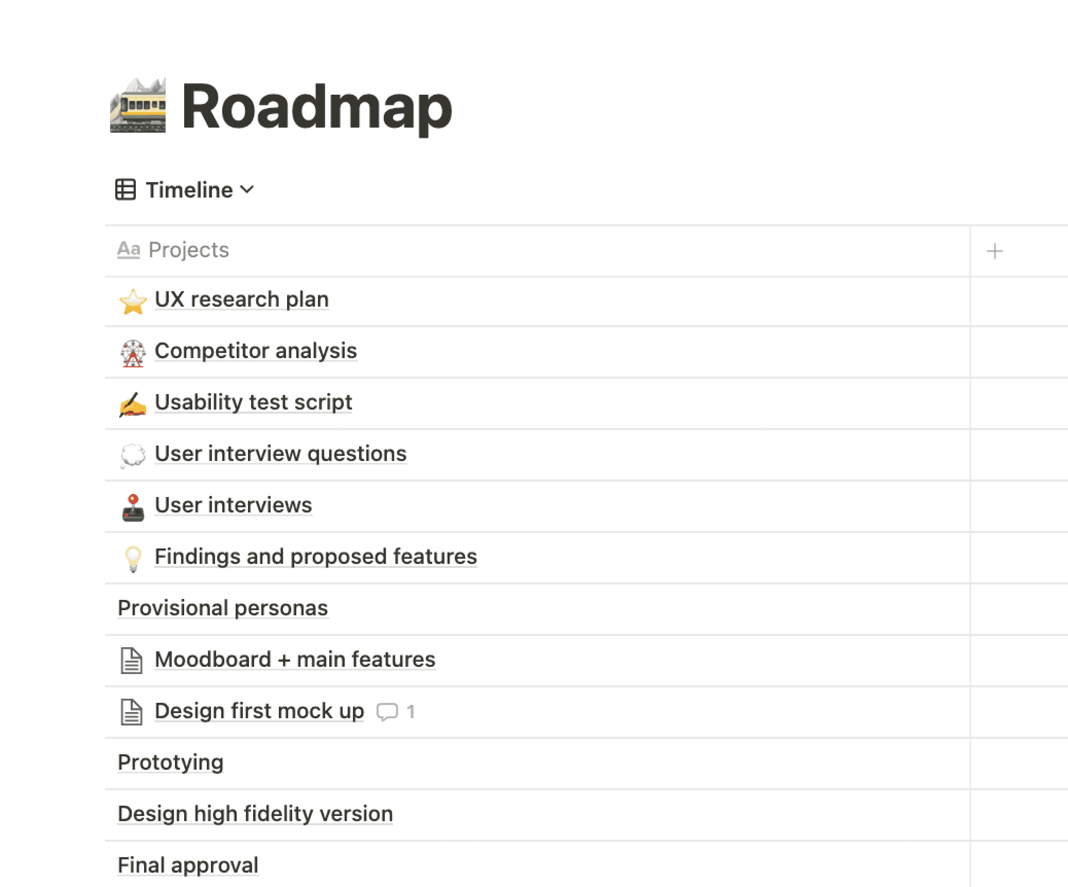
Project goals and features
Based on my research findings and the project goals, I listed the most important features for the product page (see graph).
How we prioritised features
- Product gallery and video
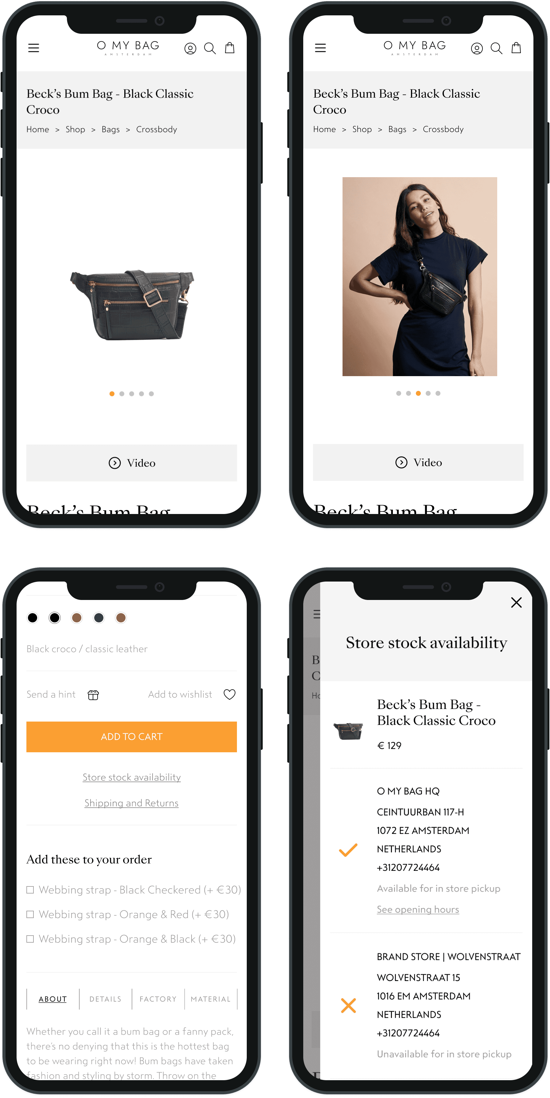
I collaborated with the engineering team and e-commerce manager to implement these features efficiently, recognizing the importance of seeing details at a glance. We decided to experiment with a video button for the new collection pages, and leverage existing content. We realized that can help users perceive all the details of a product by:
- adding images of products with models right after the hero image
- ensuring consistency and high-quality product pictures across all pages
A video button meant minimal dev effort, but creating the content wasn’t. As the content for the new collection was already shot, we decided to add the video button as an experiment for the new collection pages.
- Shipping info + return policy
Since we already had a pop-up page with shipping info we realized we can place the return policy details in the same place, and keep the same structure for minimal dev effort.
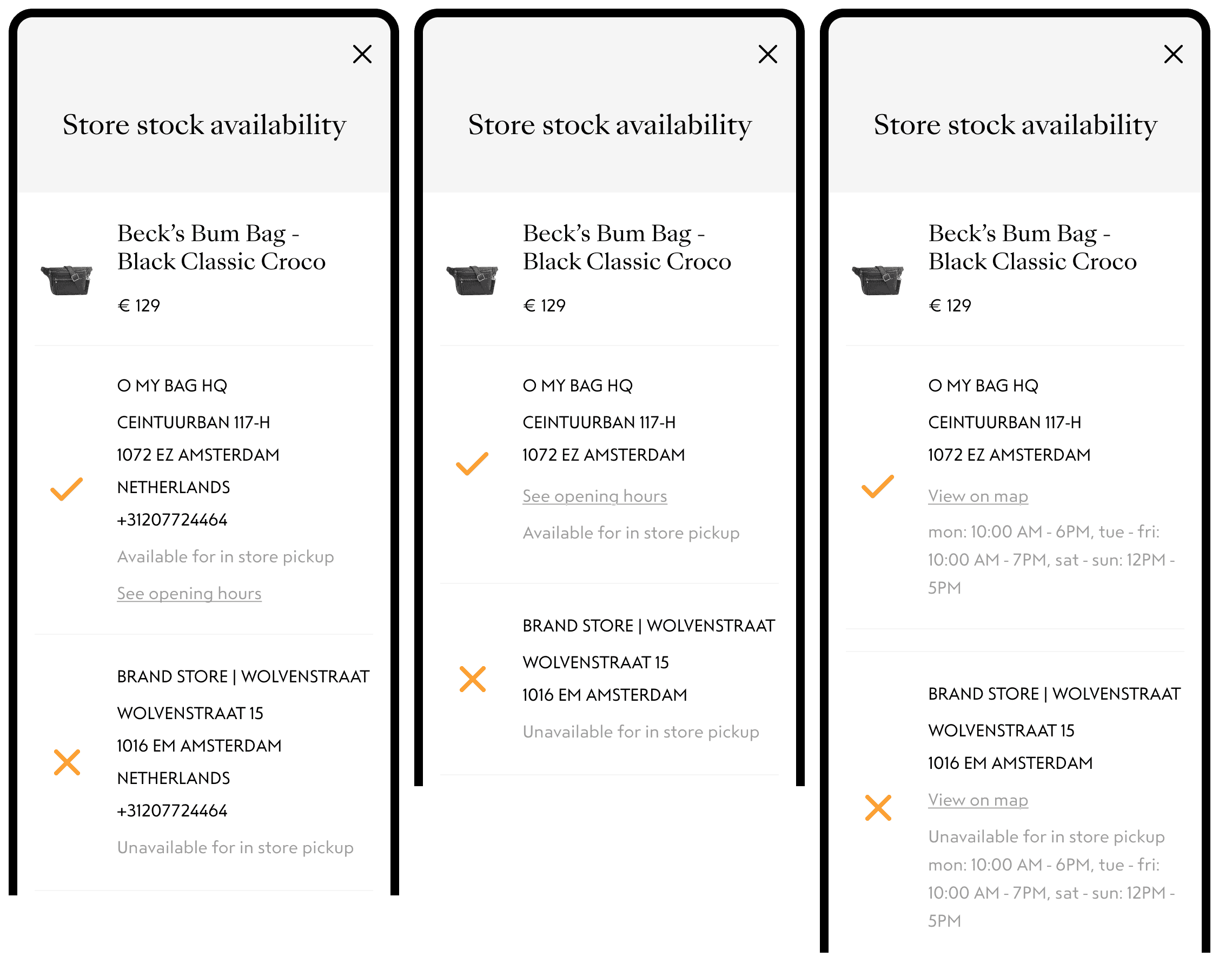
- Store details + stock availability
We learned that users expect to see all the product info on the same page. The user tests showed us that it was highly unlikely that users know what page has the additional information. We decided to merge the two features in a pop-up page format.
Ideate
Design explorations for the product page
I facilitated a couple of workshops where everyone presented their ideas, and we voted on the concepts that we would move forward. Based on the concepts that got the most votes, I created some mid-fidelity designs and took them to feedback sessions with the other team members. Based on the feedback, I iterated on the designs for the image gallery and store stock availability pop-up. Why were these two our highest confidence features?
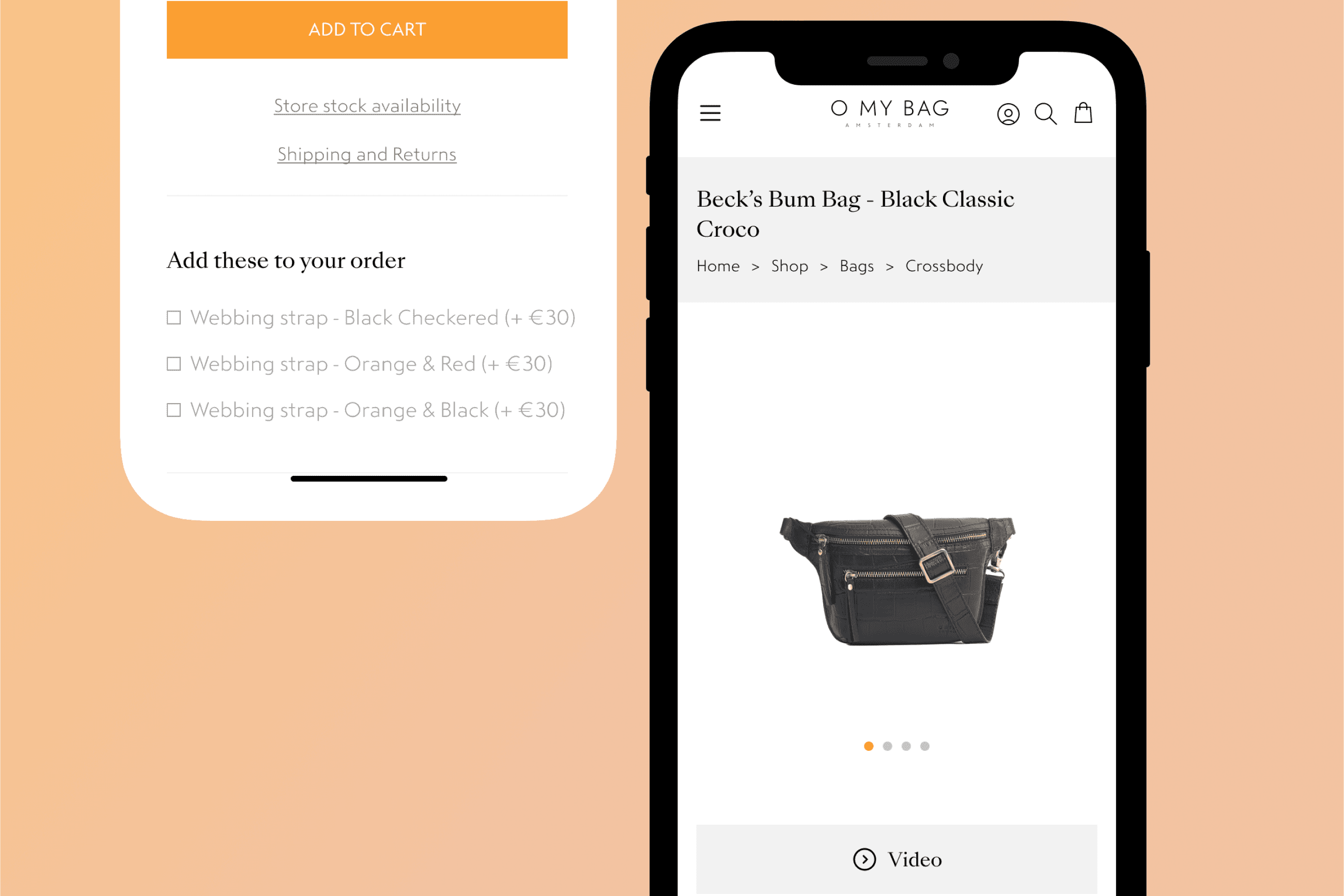
Store stock availability
We wanted to give users the freedom to visit the store and check the bag/pick it up in person.
When doing user testing, we notice that users spent a lot of time looking for product availability and store location info. Placing it next to shipping info was interpreted without difficulty or misunderstanding.
Image gallery
During Hotjar session recordings and user testing sessions on PC and mobile, users encountered friction while navigating the image gallery.
When I A/B tested the three options, we hypothesized that the drop in conversion was because people found it difficult to understand how to interact with the gallery. The results of the user testing showed us that users found the contrast in the navigation bullets the most intuitive solution.
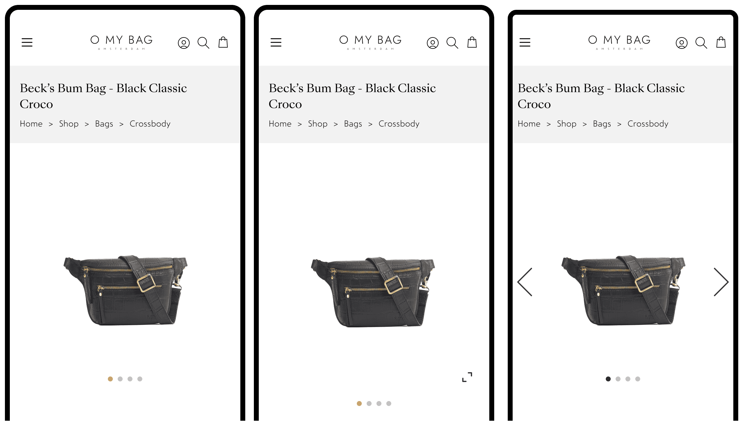
Final design
A structured way to visualise the product page
The product page opens with a gallery of product photos. Product photos with models appear early on to help people get a feel of the scale of the bag. Through the video button, people get a clear understanding of the bag's details and features in under 30 seconds.
Discovering if the product is available in physical stores is a breeze; users can quickly see a list of stores, complete with details and opening hours. For shipping and returns, users will get another pop-up that lets them get all the information they need All these features help people trust the business and make easier, smarter, and quicker shopping decisions.
Test/iterate
Next steps
If time and budget allowed, I would dive deeper into the long-term impact of the newly added features. I would look at session recordings for the product pages and evaluate the performance of the stock availability and video button features. My success metrics are to:
- Measure the % of product return rate from the online store
- Measure the # of users using the stock availability feature and of those people how many use the customer service tool
- Measure the % of users using the video button, and of those how many watch at least 30% of it. This would be an indicator that they find the content useful
I would also conduct remote user tests. The goal would is to get a better understanding of how clear the product page communicates the value of the purchase, and how easy it is to find the information they need.
Key learnings
Don't over index on data
I was a bit excited in looking for correlations in our Hotjar session recordings, and adding events to track. I should have been more considerate to balance this with actual customer feedback because the numbers didn’t tell us the whole story.
Involve customers early on
Had I involved users earlier, the quality of project goals and feature proposals would have been more representative of the actual issues instead of losing room to visual nitpicking.
Establish a cadence
Not being full-time dedicated to this project often made me feel like I was parachuting in and out. I should have been better at establishing a regular project update, which would have helped me earn trust from the stakeholders sooner.