Onboarding on AutoScout24 app
As the UX designer within the Growth team, I led an initiative to address the challenge of low user retention rates on our app. Through A/B experiments and user research, we identified opportunities to enhance the user experience and increase engagement.
Context
More than 70% of our app users don’t come back after the first session. In an initial experiment, we confirmed that adjusting the visual hierarchy of action buttons positively influences the user experience on the app home screen. With this success and first users as our target audience, we decided to dive deeper and understand user expectations, pain points, and motivations with a mix of experiments and user research.
My role
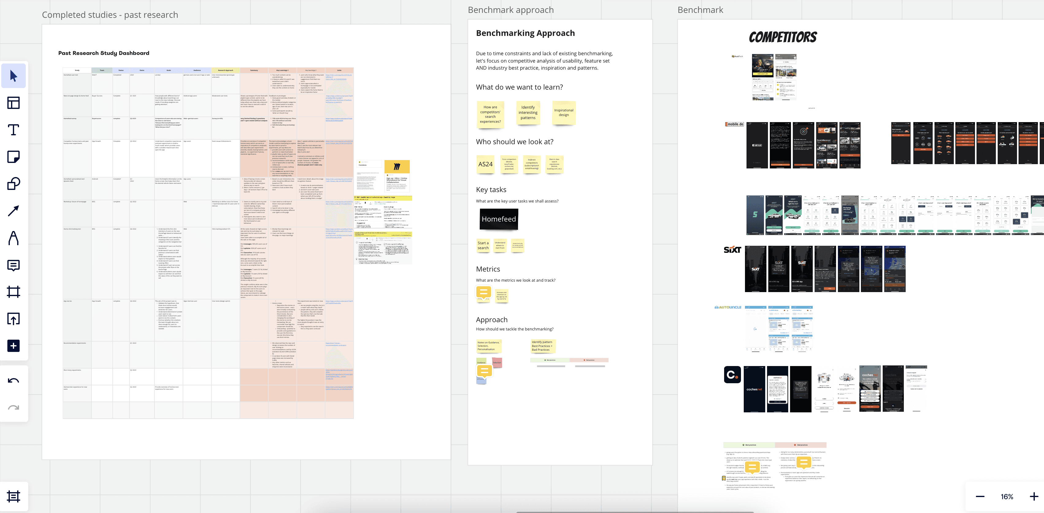
I was the dedicated user experience designer at the start of this project within the App Growth team. To define the requirements and scoping, I put together a Miro board with past research, potential constraints and a competitive benchmark in order to align UX, PM and Engineering teams.
Design processes are non-linear
And this project is a perfect example of that. As part of the growth team, design delivery and discovery might often take place in parallel, and that’s ok. As long everyone involved is aligned on the main goal, and release strategy, we can be confident and focus on gathering learnings.
Key deliverables
Clarifying context with the product team
- I developed a contextual understanding of the design task in order to understand the user journey and the segments we are designing for
- I covered a benchmark analysis and an overview of heuristic evaluation applied on our home feed, home feed navigation and search flow on the app
- used past research to define hypotheses and a first solution for the app initiative
Defined and delivered two experiments on the app
- goal: gather quick learnings and understand user needs in the early phases of using the app
- I explored and prototype different solutions
- documented and iterated on the feedback Key deliverables for the user research
Analysed and refined solution
Together with PM and stakeholders from the Growth team, decided to iterate on the solution by performing user research.
UX research and strategy alignment
- I put together the research and testing strategy
- worked the proposal for moderated user tests with a focus on onboarding questions
Facilitation
- I planned and facilitated design thinking workshops with engineering, research, content design and product manager
- documented outcomes and shared learnings with the design team and involved stakeholders
- translated outcomes into next steps for moderated user research
It all starts with data and insights
Results from a recent competitive user test on the home feed app validate previous experiments that user’s main need/expectation in the first app session is to find a car. Looking at click through rates on the app home screen, we could see that the save search had the highest rate between navigation menu icons.
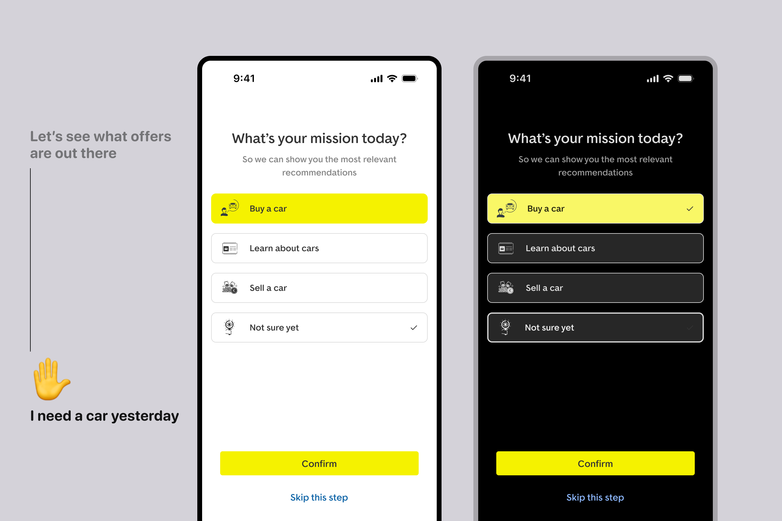
After running a how might we (HMW) workshop with the product team, we decided we wanted to test an onboarding solution on the iOS app. We believed that by asking users onboarding questions we can understand their needs and later on their journey personalize their experience to improve activation.
Solution exploration
What we did
The design explorations focused on understanding the job to be done of the app for the users. During this process, we made these key decisions to align with heuristic principles:
- visibility of system status: clearly ask the user what their mission is, indicating the app’s context
- give users control and freedom: allow users to skip this step if they are not ready to answer
- clear, consistent copy: user language that is easy for users to understand
Initial validation
We ran the first A/B experiment as a data collection exercise, the goal being to understand users better, so we can personalise their experience to improve user activation. This first experiment did not impact our core metrics, which led us to design and run a second experiment.
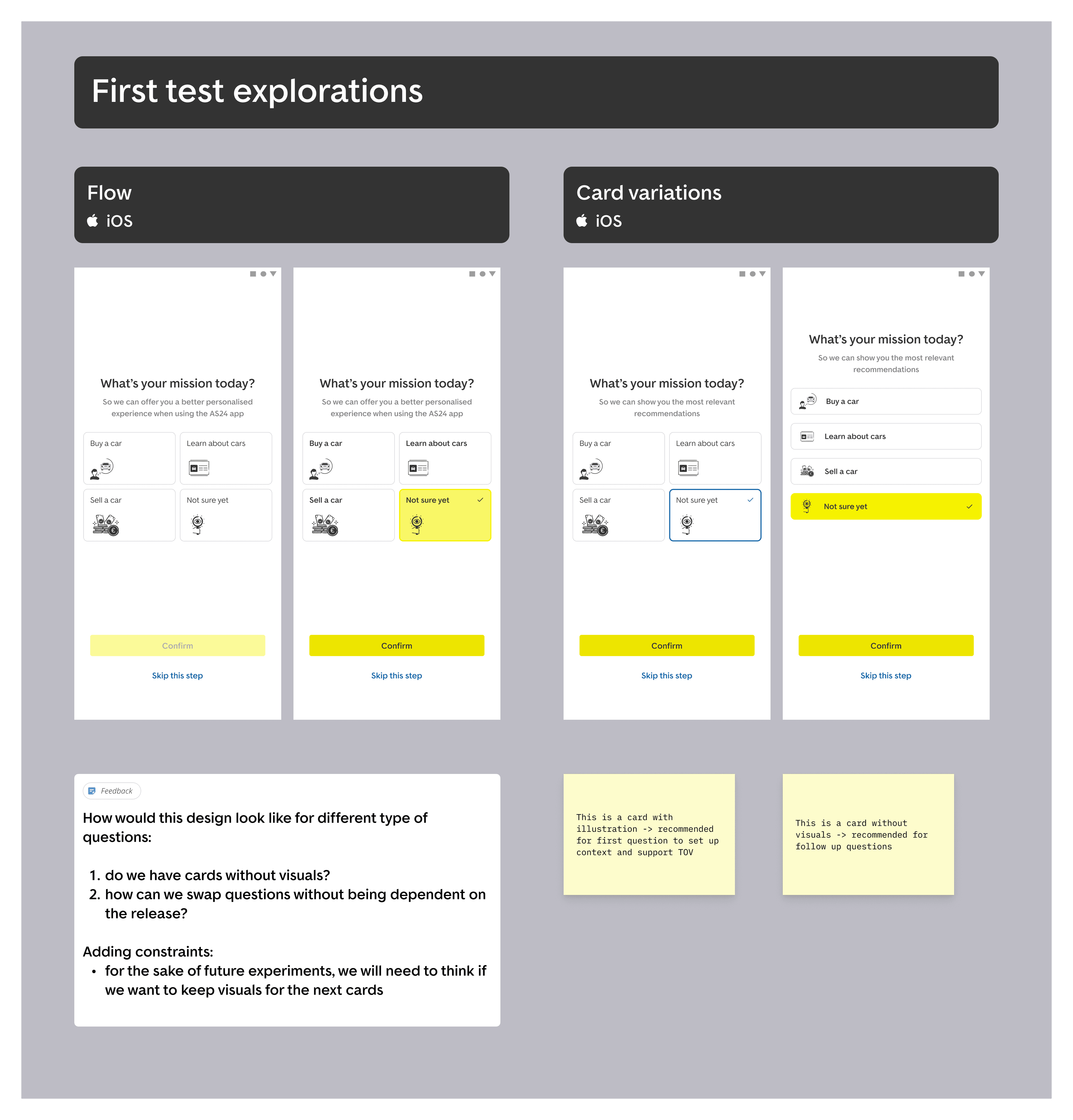
We designed the second onboarding experiment to understand user urgency and personalise copy on guidance element on one of the main app features. In line with the design, I started refining the UI for the onboarding questions.
Design iteration
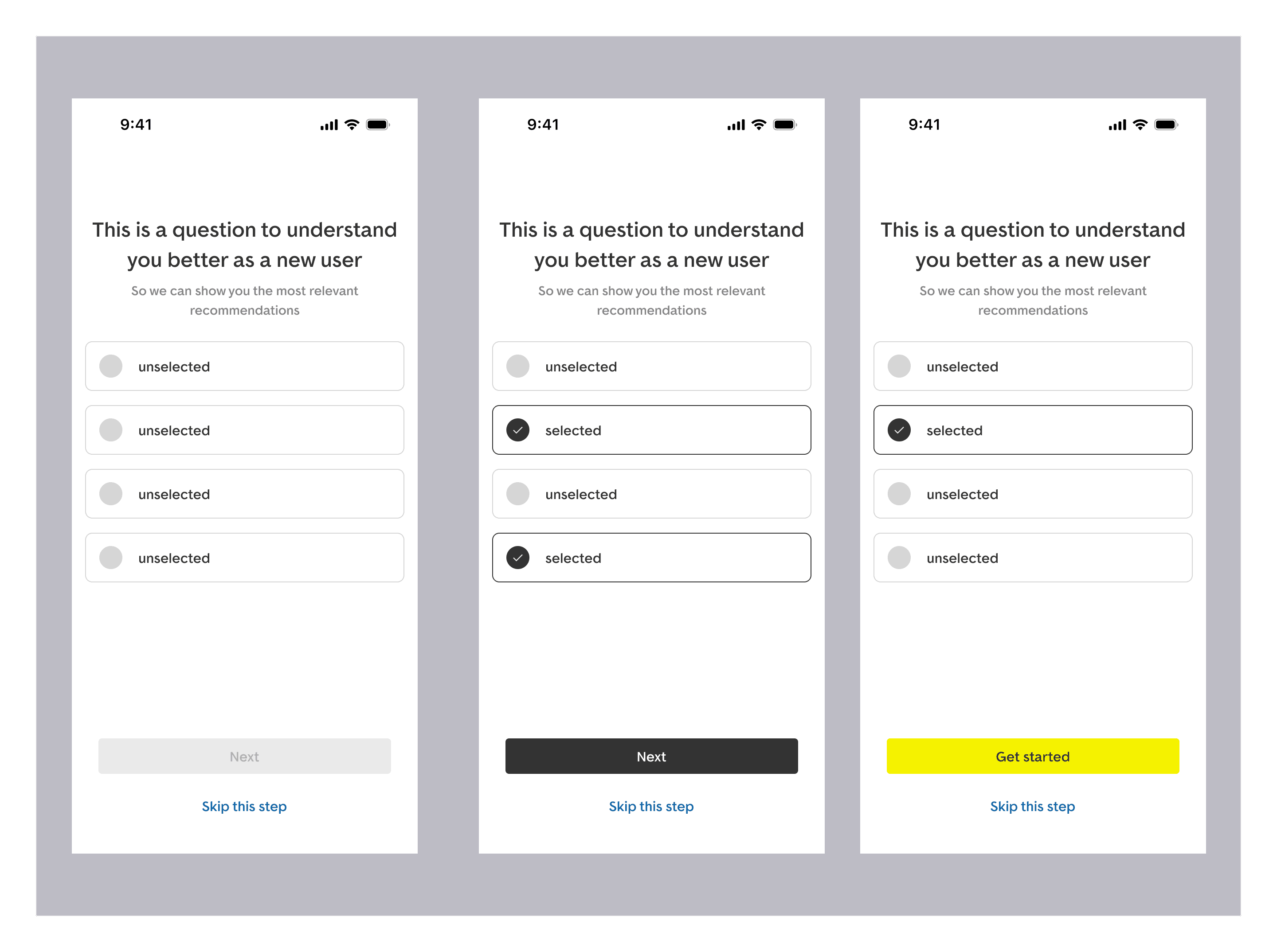
To help the onboarding initiative, I put together a vision for an onboarding flow, following main UI heuristic principles such as
- Visibility of system status: the design clearly indicates the progress between the screens (“Next” and “Get started” buttons, guiding them through the process)
- Match between system and the real world: the language we use is simple, user-friendly, and will use a familiar, personable tone of voice
UX research strategy and alignment
Together with the UX research team, we decided to take a few steps back and focus on what we need to know about the user to make them more successful. The first step was to run an workshop with the product team and brainstorm questions for the app onboarding.
Why did we prioritise the questions at this point?
Moving forward with questions without user validation brought some risks: there was a chance that our take on the questions might not contribute to an improved user experience.
Since UI design was not a part of the project at this stage, we applied our design principles and guidelines to crafting the onboarding questions. Our goal was to ensure these questions were clear, concise, and accessible to all users.
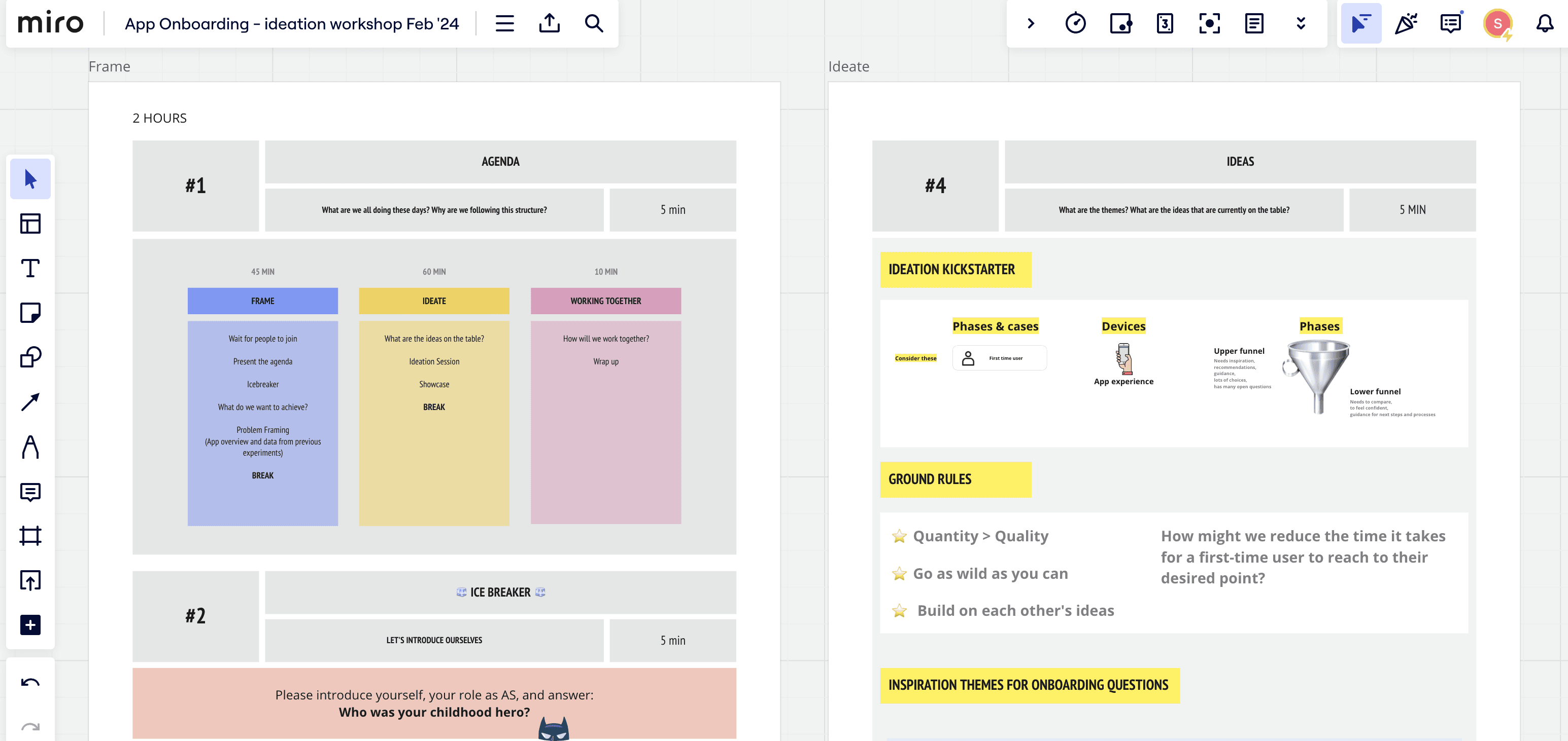
Ideation workshop
What we did
In collaboration with UX research, I designed a workshop session for the product team in order to generate the onboarding questions.
We covered
- data and insights from past experiments and user research
- ground rules for ideation
- an inspiration board with onboarding themes (based on the previous benchmark work)
- 3 rounds of brainstorming focused on team collaboration to formulate the questions
The workshop was a great team collaboration experience, as it helped engineers gain a better understanding of user’s mental models and be an active part of the creating a range of different possibilities to learn more about users.
This workshop made me understand there are so many possibilities to onboard a user: understanding their background, needs, pet peeves.
The ideation session intro made it clear on what's the problem we are working on. The user feedback results helped in understanding the problem.
I really like to be involved in product decisions. It makes me super enthusiastic to push forward towards a more user-centric product
Lessons learned
- Research more, execute less
- The right questions mean more than answers
Next steps
Once we had the resulting questions, we prioritised the questions based on the key audience: new users and main goal: increase activation on the app. This became part of the main activity that we plan to run in the near future.