Validating Car Reservation
Streamlining car purchases via reservations connects buyers and dealers. Explored user concerns, business models, and market differences, addressing affordability and trust challenges.
Context
In 2023, the Buyer Success team was tasked to validate a digital retail solution. Through a reservation option, our product would help buyers who were actively looking for a car. By making a payment, which could be a fee or a down payment, a buyer could reserve a specific car for a certain period. The reservation system would connect the buyer with the car dealer, reducing time and effort to finalise the deal.
Reserving a car on the AutoScout24 platform was seen as an opportunity for us to solve user problems such as affordability, and trustability in the dealer. But we were still missing user validation. To clarify these hypotheses, I decided to open up the problem space and understand broader user problems and questions.
We considered: validating the user’s understanding of the reservation concept, survey to uncover benefits and concerns, different business models that came under reservation, scalability in different marketplaces to understand differences in buyer motivation.
My role
Project planning
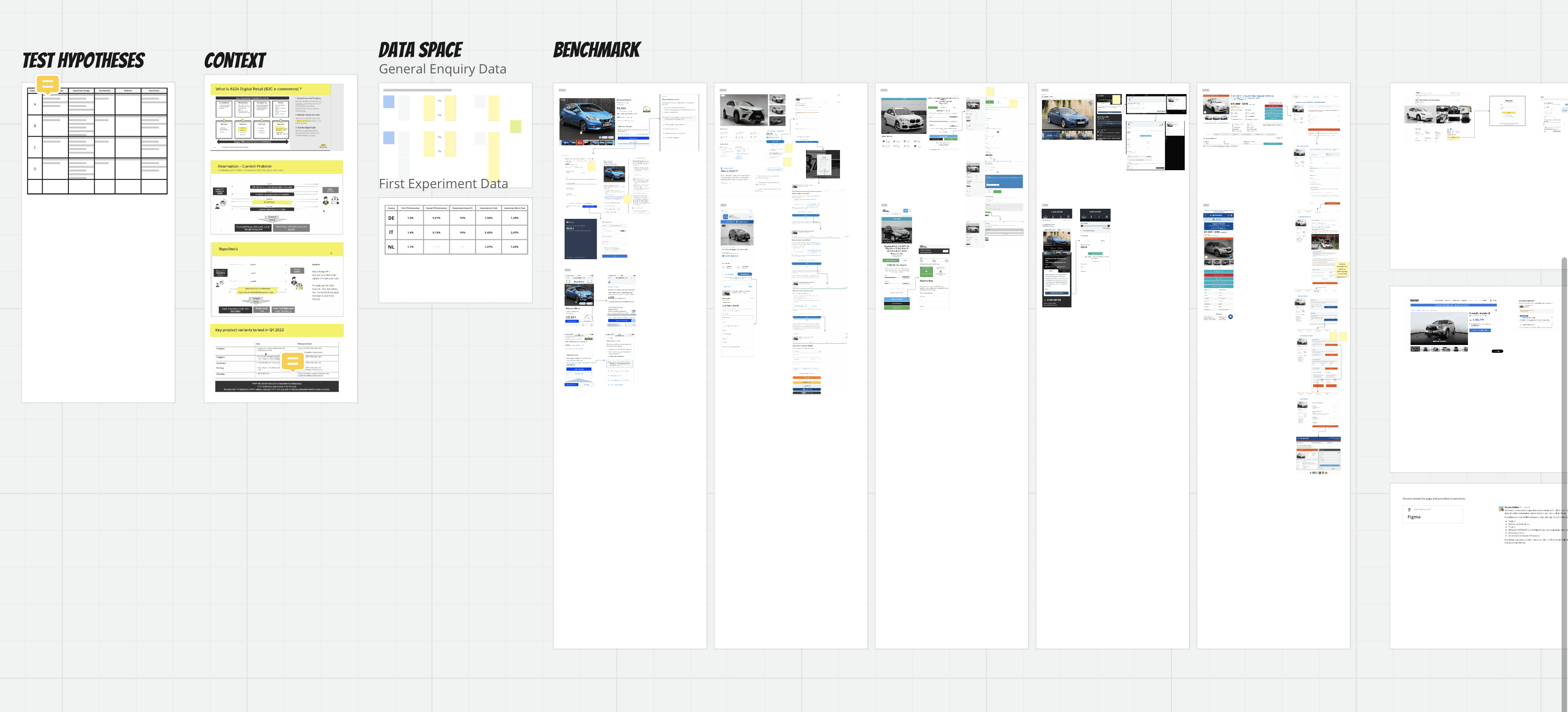
In preparation for testing the reservation service on the product page, I compiled a process to separate what we know from the areas we still needed to validate. I worked together with the Product Manager(PM) and UX researcher to collect all available data and competitor benchmark. To get stakeholder buy-in, I also identified all the questions that needed to be answered before we could proceed with the solution.
Stakeholder management
As the main designer, I ensured clear and consistent communication stakeholders, sharing updates, learnings and keeping the space open for questions and feedback.
User research and data analysis
Led research and testing initiatives for rapid user tests focused on the reservation concept, abd also general surveys to understand how the product would be received against other contact methods. I collaborated with the content designer and UX researcher on copy variations, heuristic evaluations and user testing sessions.
Documentation
I documented every stage to share in design presentations, all hands, and project updates. Research insights backed by data points and UX logistics were the main elements I used in every context, to maintain transparency and collaboration with stakeholders.
Design
After identifying the different problems and opportunities that could be solved by a reservation service, I zoomed into different solutions to prototype and test with users.
Thank you for continuing to challenge the thinking around the reservation project, and reminding the team to zoom out and think about it as a larger problem to solve - the answer may not be in reservation, but somewhere else, but we won’t know if we keep a narrow focus.
Sabrina’s work in the Digital Retail project went beyond identifying unknowns. She played a crucial role in shaping the project’s path by defining how reservation validation should occur. Her attention to detail likely influenced critical decisions, ensuring accuracy and effectiveness.
Sabrina has been bringing her A game to the Digital Retail project. Taking the lead on the project I have seen her coming up with amazing design solutions and stakeholder alignment.
Understanding/Defining the problem
Internal perspective
- Our research indicated that the car buying process can be frustrating and repetitive for both buyers and sellers, often leading to wasted time and resources. We believed that introducing a reservation system could streamline this process, making it more efficient and better targeted towards high-interest customers.
- To confirm the need for such a reservation system, the product team planned to conduct a series of ‘fake-door’ experiments. These would involve presenting users with various feature variations, including the product’s payment structure, reservation period, price, and the next steps for car reservation. We decided to run these testsin Germany, Italy, and the Netherlands to see if cultural differences might affect how the product is perceived.
User perspective
We didn’t have the user’s perspective. Together with the UX researcher and content designer, we decided to run unmoderated user tests in parallel with the fake-door experiments. The goal was to explore the problem space, inform design decisions, and effectively communicate the benefits, needs and motivators through a solution that shows value, clarity and credibility
To gain stakeholder support, I summarised how this would help us:
- Alignment: Align messaging to match what’s on the user’s mind
- Improvement: Does it eliminate a pain point, or does it enhance their life?
- Justification: Convey why our solution is the best one towards that desired outcome
- Clarification: Answer the “so what do I get and how do I get it?”
- Mitigation: Understand how we can address uncertainties, objections, perceived risks
Key deliverables for the user research
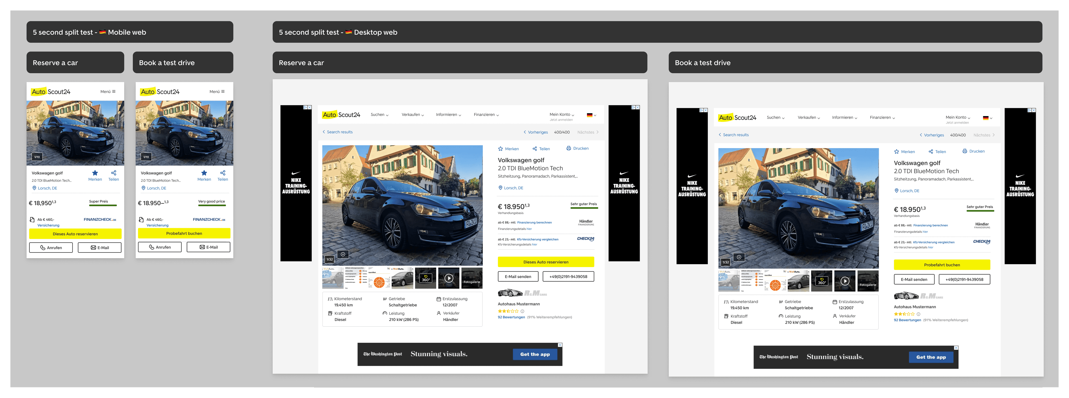
Rapid user test (unmoderated)
- What: two screens (testing CTA copy book a test drive vs. reserve a car)
- Audience: only in German, participants from the tool (ppl looking for a car)
- Question 1: what do you expect this concept means?
- Question 2: under which conditions would you pay for this?
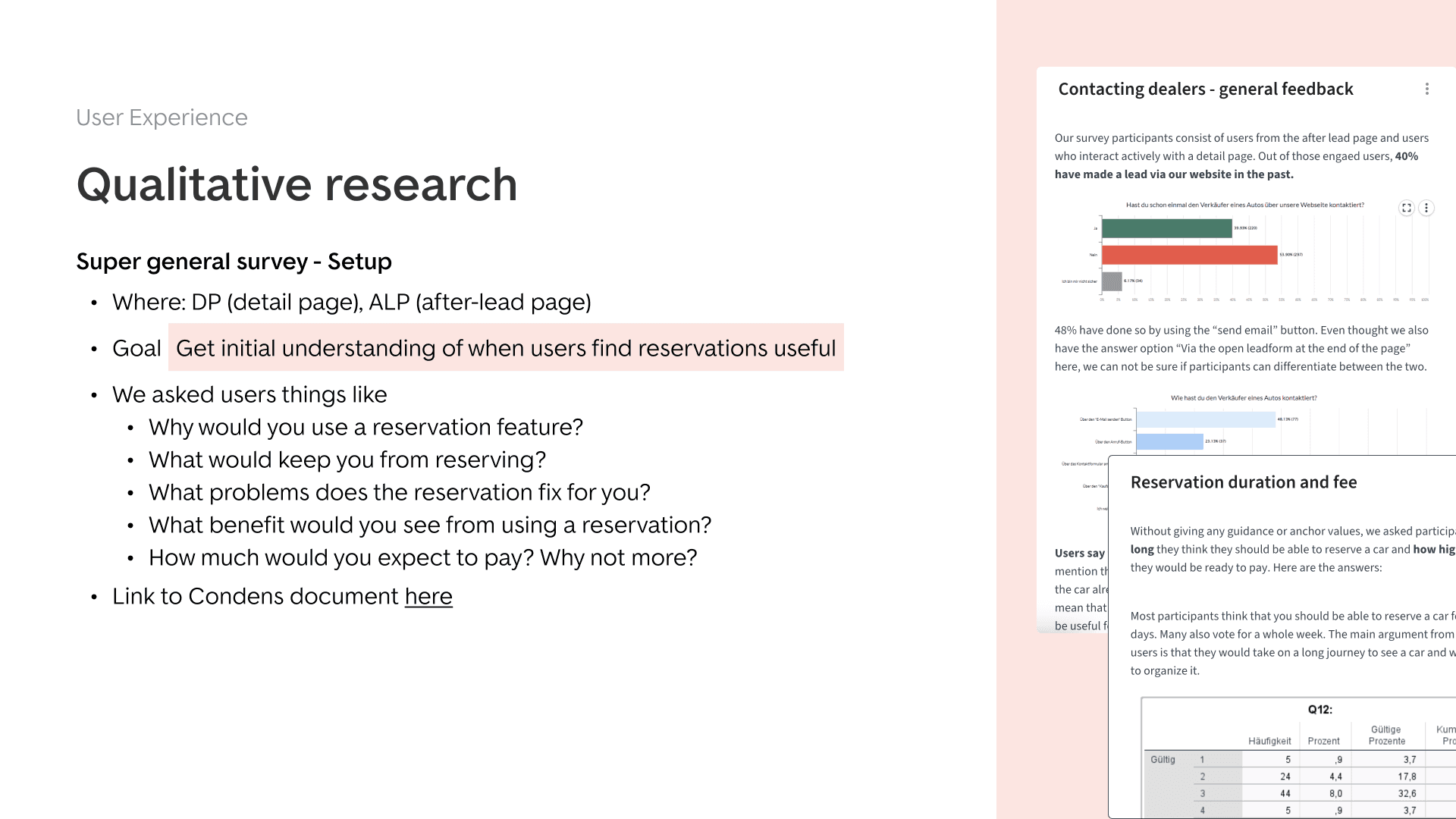
General survey
- Non-dependent on design
- Audience: Will run in Germany (German) and The Netherlands (Dutch, with support from the Dutch team)
- Logic: Will be triggered on the product page and after lead page
Survey in fake door test flow (inserting a question inside the design)
- What: survey that gets triggered when users choose to not continue with Reservation option > why not reservation?
- Logic: Survey is part of the “reserve a car” flow
Ideating solutions for the fake-door test
What we did
- Created different takes on how to solve the problem, strongly informed by best practices
- Defined trade-offs for each solution
- If we deviated from an already existing solution in AS24 (defining a new component: we added explanation
- Worked towards WCAG AA (contrast, mobile accessibility)
Prioritisation
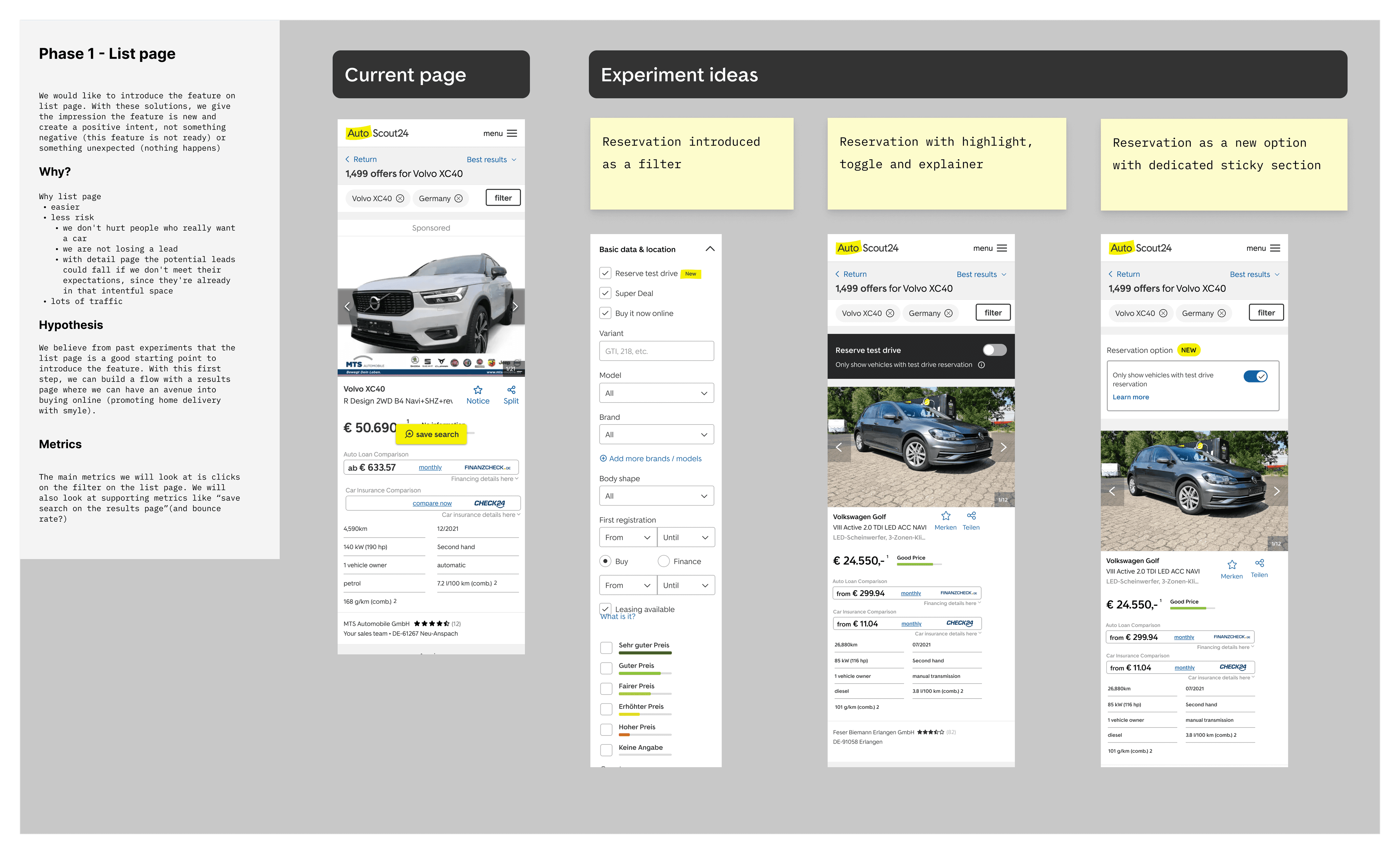
How and why we prioritised reservation for the product page
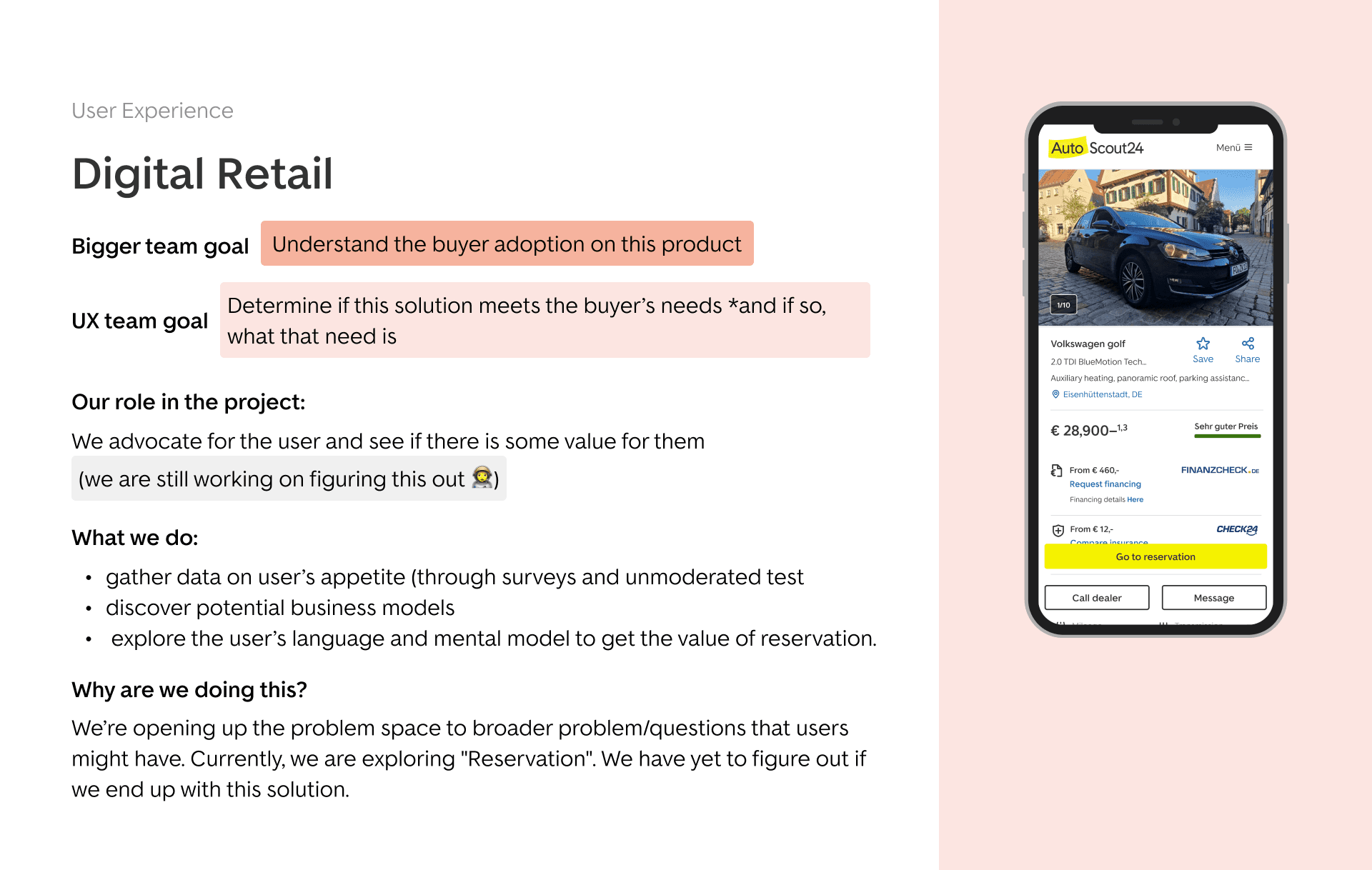
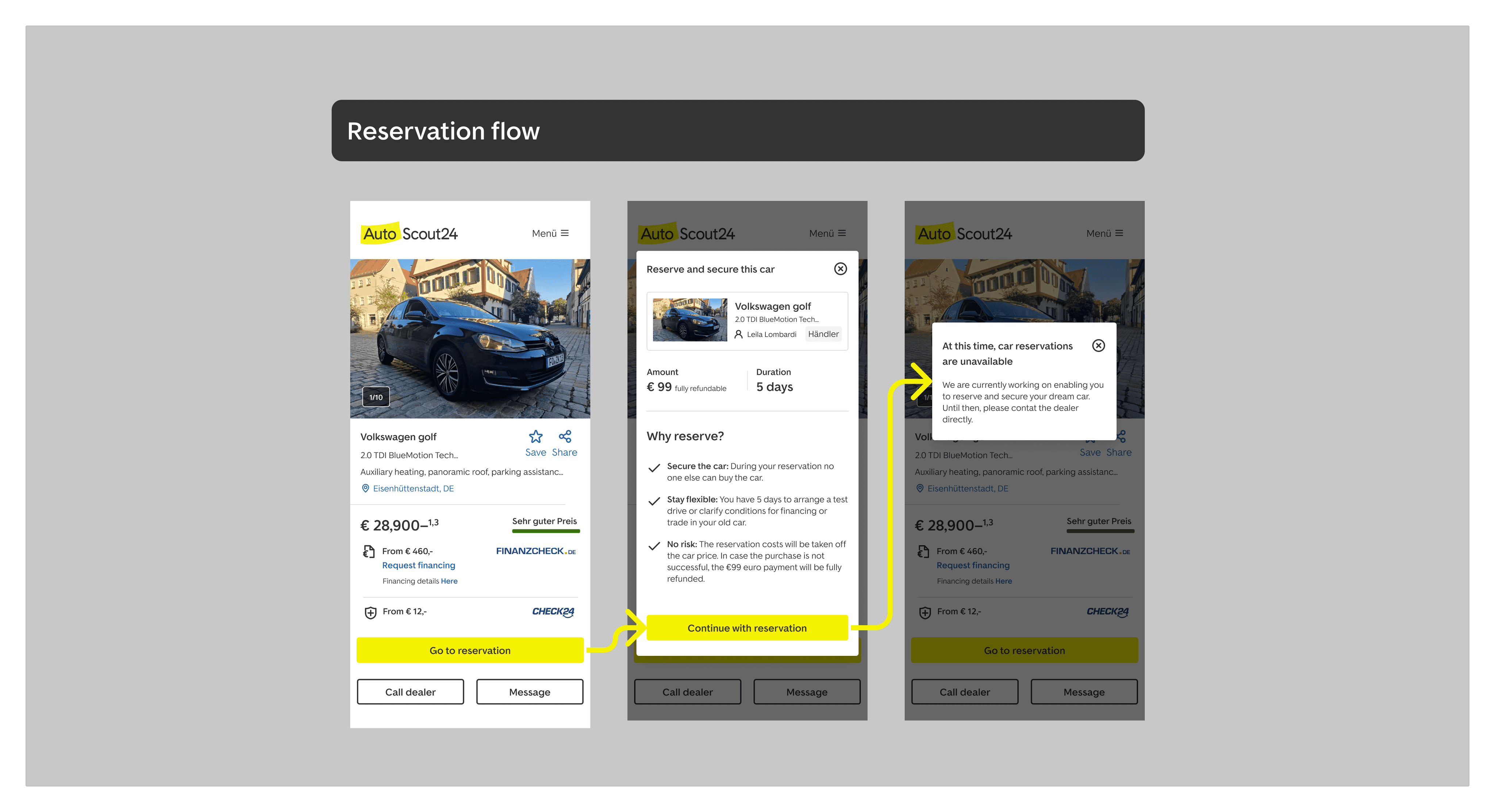
In line with the goal to understand the buyer adoption on this product, we decided to focus the reservation solution on the product page. The starting point was to introduce reservation as a primary action button.
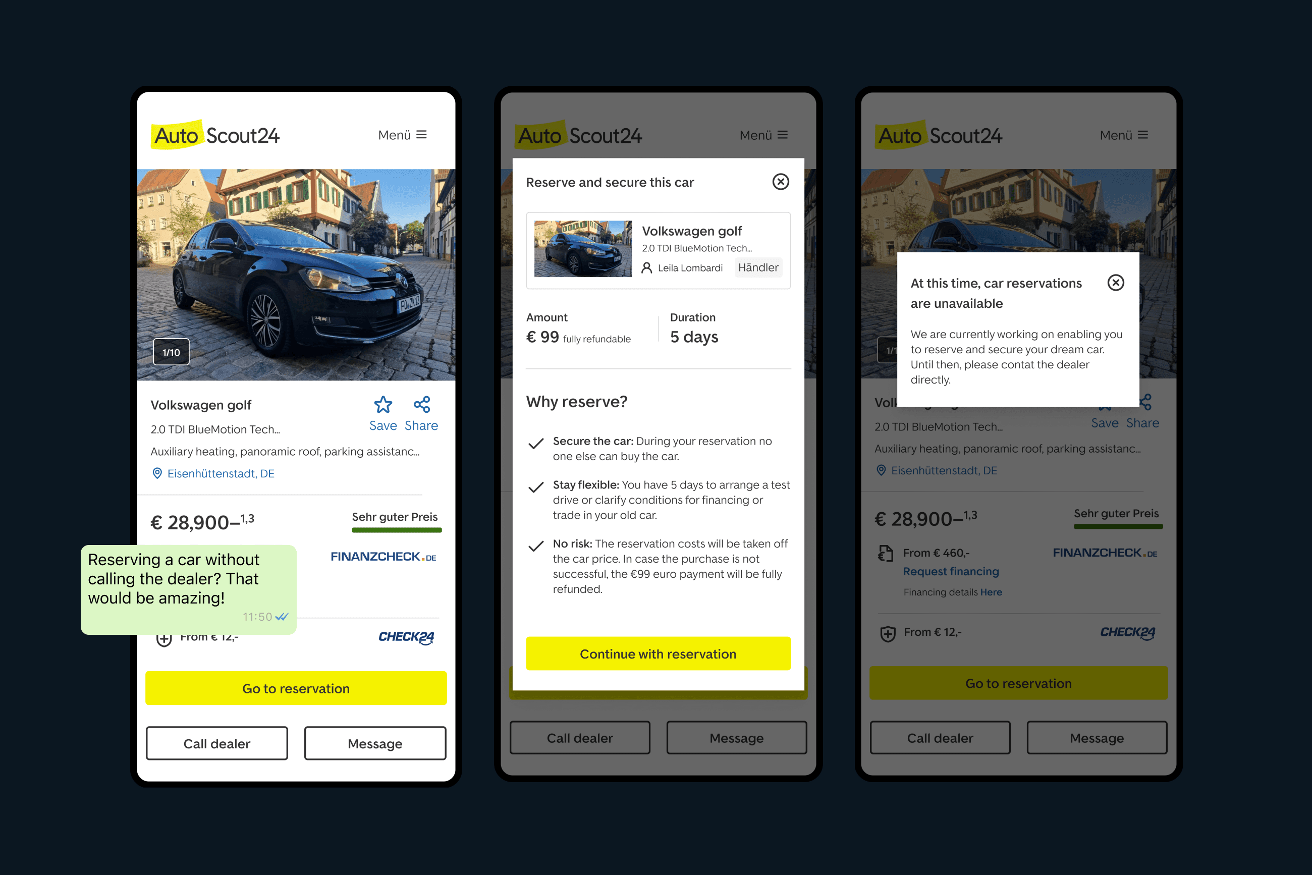
CTA: Go to reservation
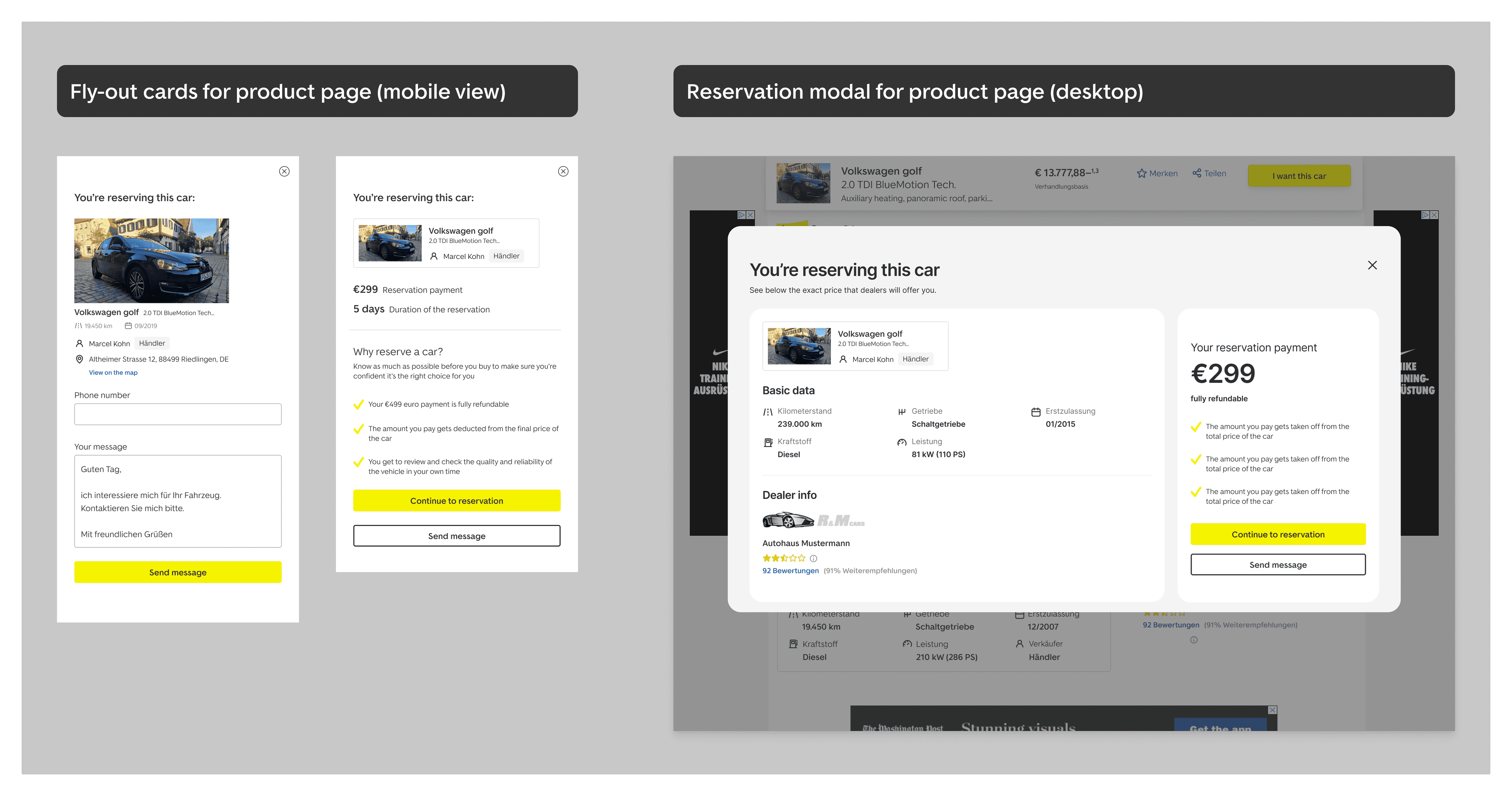
First screen: A pop-up modal which would outline the specs of the reservation. The main elements would include a summary of the vehicle that the user is enquiring for, the price point, supporting copy for the reservation, and a “Continue” button.
Second screen: A second pop-up modal, informing the user about the state of this feature, with a suggestion on how they can continue their journey
We challenged the initial design for error prevention in the user flow.
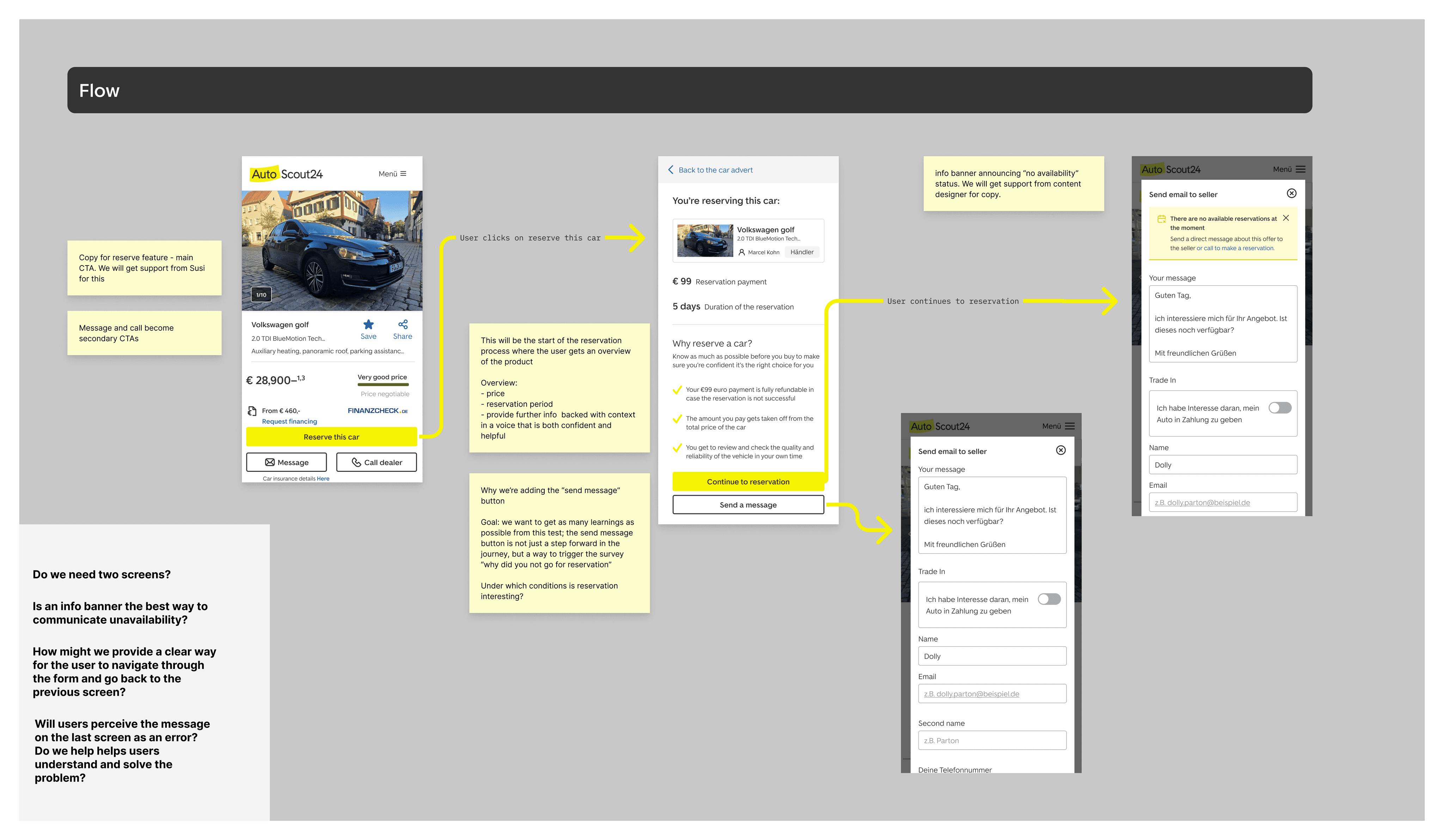
Design Iterations: Do we need two screens?
During the prototype phase, we invited our product partners to design feedback sessions to evaluate the user flow. This ended up being a crucial step in refining the design details.
We noticed that the wording on the action button on the second screen could potentially mislead users. Given that users have already chosen the reservation option, encountering the lead form again could be unexpected. Also, the information we provide about the reservation status could be interpreted as an error message. This would fall against one of the key heuristic principles that we focused on: enabling users to recognize, diagnose, and recover from errors.
We realised that we don’t need two screens, and we can focus on the first modal screen to explain the specs and value of the reservation feature.
Experiments and prototype testing
1. Rapid user test - Reservation vs. fee
What we did
- Reveal if unintended ambiguity for the “fee” approach (This helps us decrease the possibility that people might not proceed because they didn’t understand or understood incorrectly)
- Show the “downpayment” approach again and also test it for clarity
How the learnings influenced our prototype
- Although this first test was only focused on changing the copy of the action button, we learned a lot about user’s expectation about the next steps and perceptions on the reservation feature
- Most users had questions about what happens after they reserve a car, which helped us create copy that matches the system and the real world
- The user’s input from this experiment also helped us formulate verbatim copy when defining the specifications and value of the reservation feature
2. General reservation survey
What we did
- Launched a general survey focused on understanding user perception on validation, targeting users in our German market
- Generated insights into the perception of the car reservation concept
Learnings that influenced the project
- Without any design context 53% of users said that reserving a car would be an interesting option for them
- We also gathered insights on user’s expectation for duration, price and conditions
- The survey ran for three weeks and gathered 660 participants
3. Fake door validation experiment
What we did
- Launched the fake door test in two countries (Germany and Italy), and used learnings from previous experiments to explain the reservation concept
- Iterated and launched second experiment, exploring two different business models:
- Fee: Charging the buyer for “saving” a car
- Downpayment: Charging the dealer for helping them find a motivated buyer
- In parallel with the experiment, we also ran a second unmoderated test, showing the two variations with the goal to understand how users perceived the two concepts.
Why we went for a second unmoderated test
- We wanted to validate if people understood the “fee” approach correctly and reveal unintended ambiguity
- This helped us decrease the possibility that people might not proceed because they didn’t understand or understood incorrectly
- We also used this testing opportunity to show the “downpayment” approach again and also test it for clarity
Learnings that influenced the project
- Fee vs. down payment matters: By asking for a reservation fee instead of a down payment the “Continue with reservation” conversion went down by 20%
- users understood the conditions, but expressed concerns about the potential misuse of the service
- similar to findings from the first rapid user test, people were curious about the how the process would look like from the dealer side, for both downpayment and fee conditions.
Final results
- The work was important in defining what user problem we were solving, as well as identifying first questions in terms of how this would look like in the offline world
- The fake door indicated buyer validation for reservation
- Initial CTR for “Go to reservation” = 0,35% (4.391)
- Initial CTR for “Continue with reservation” = 16% (329 sessions)
- The team uncovered bigger questions to answer in terms of dealer onboarding and platform management for listings and leads across different car marketplace websites
- Introducing a new way of working with UXD (UX designers) and UXR (UX researchers)
This project wasn’t just about introducing a new feature; it was a shift in our approach to collaboration between product, and the design team: UX Designers (UXD) + UX Researchers (UXR). Previously, our collaboration often began at the solution phase, with a strong focus on delivery. However, the Digital Retail project sparked a change. It turned us from deliverers to strategic partners.
After wrapping up the project, I put together a way of working model for the team, highlighting the need to use data and insights to uncover a range of problems and opportunities. We currently use this inside the Growth design team to explore different ideas and designs before choosing one, making sure we’re not just solving problems, but solving the right ones.